Services
Insights Dashboard
The go-to event engagement Dashboard: Everything you need, one place
Hosting an event can be challenging. This is true whether you organise virtual or in-person events. We at Exposure Analytics know this well, having consulted with major venues and event organisers in over 35 countries.
To keep a close eye on your event performance and, more specifically, your engagement with event attendees, we install smart sensors that collect critical insights into customer behaviour.
You can access the Dashboard through any desktop or smart device, from anywhere in the world, and gain instant access to vital metrics – like footfall, occupancy, flow routes, and more.


Metrics we measure:
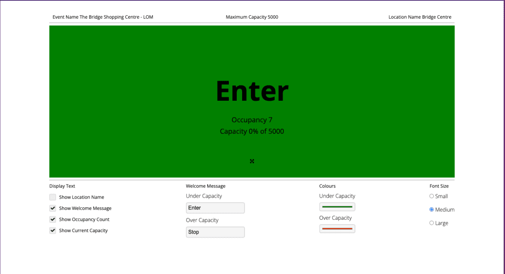
Occupancy
Using Apex we can accurately measure the occupancy of an area, hall or space in real-time. This is ideal for health and safety capacity issues.
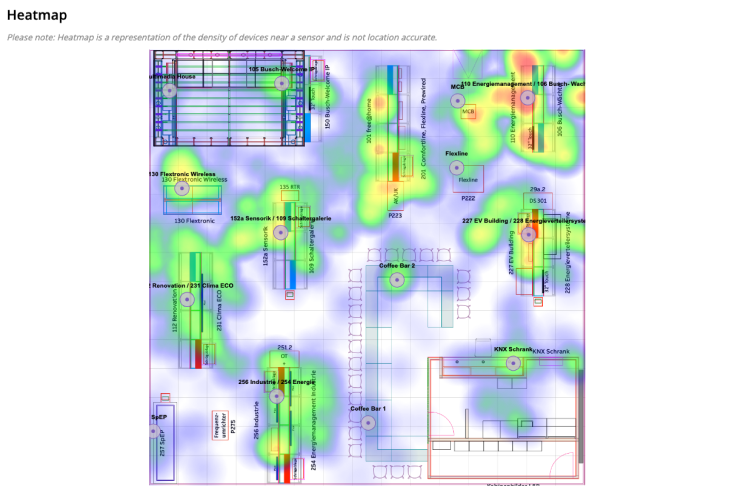
Heat maps
This gives a visualisation of density around a sensor and can be played back hour by hour.
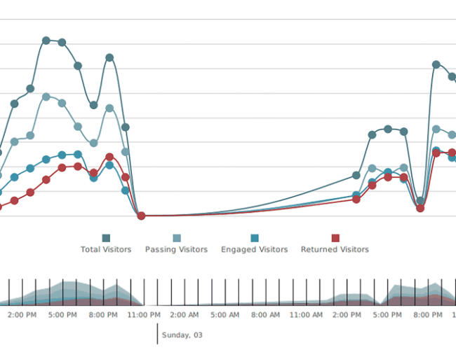
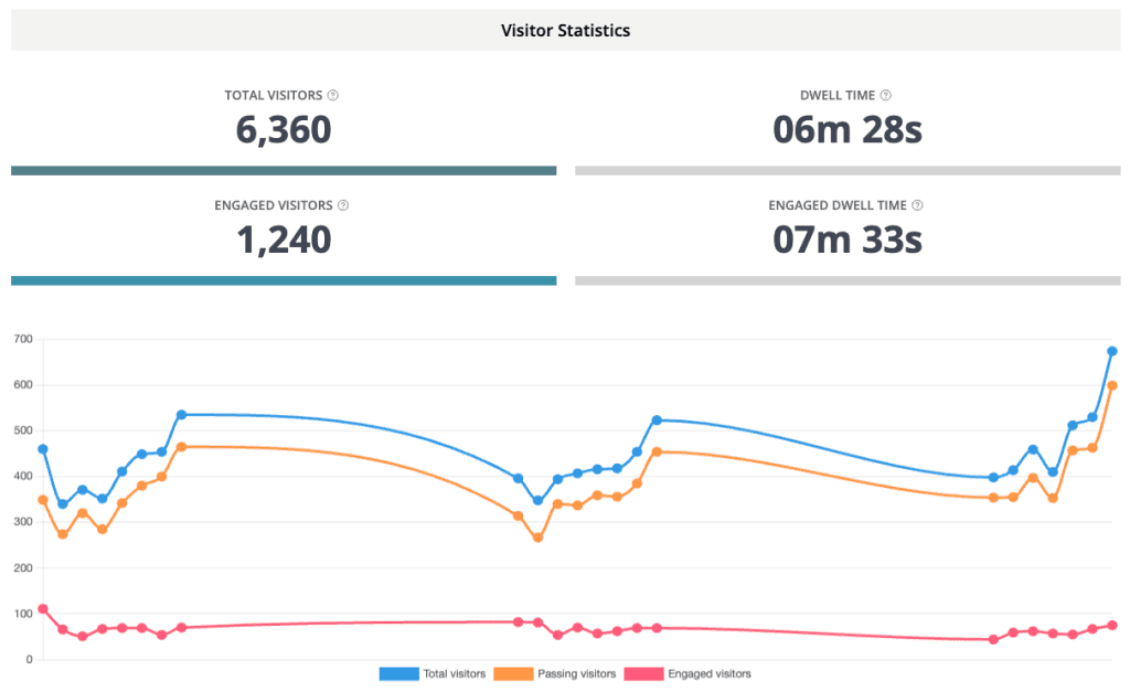
Footfall
Counts of total and engaged visitors are displayed on the summary page as well as a detailed breakdowns on each sensor with comparisons.
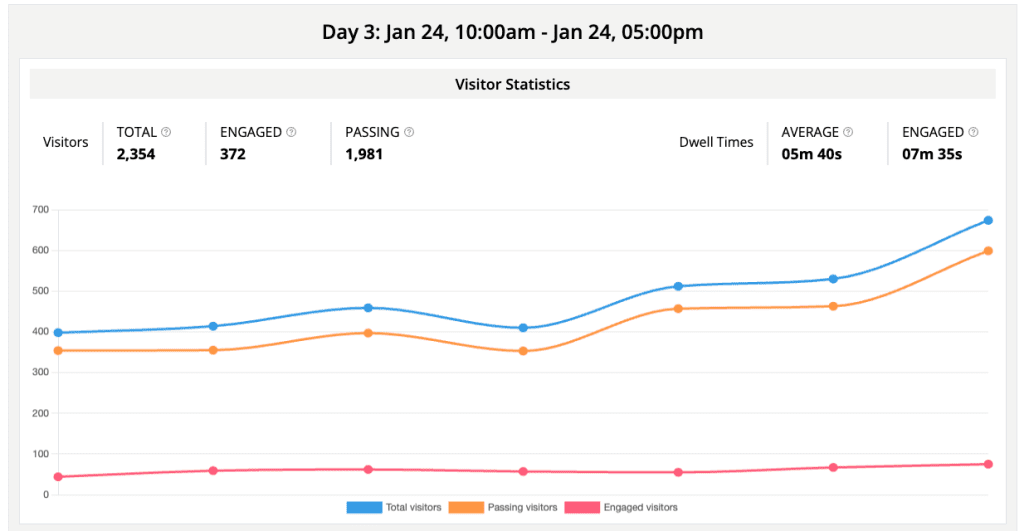
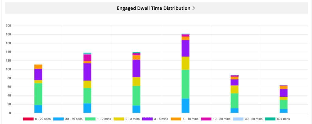
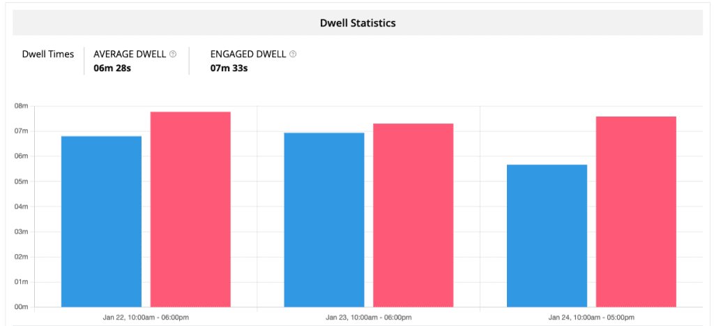
Dwell time
With Booth Dwell and Sensor Dwell times you can see how you are performing and inciting engagement with your visitors.
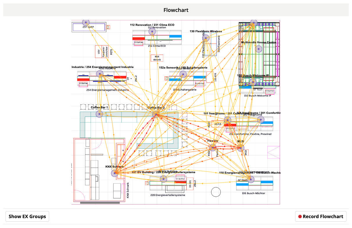
Customer journeys
See where the main entry point is and how the visitors flow round your space.
Tree maps
Is derived from the same data as heatmaps but in block diagram form and is preferred by data analysts.
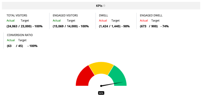
Conversion ratio
This is one of the most important metrics, how well are you at converting passing visitors to engaged. Simple changes on your booth can have a massive impact.

KPI’s
We all have them for our events but how are you managing them? Are you reaching your KPI’s? Add these to our platform and they will become part of your booth score.
Engagement
Whether it be an exhibition booth or an experiential activation it is all about engagement. Are customers engaging with your space, are they drawn to a particular aspect? Our metrics help you measure this and it’s impact.

Ready to reap the benefits of benchmarking? Try a free demo
If competitor benchmarking has struck a chord, our team is here to help you understand how our innovative technology can open the door to powerful insights. You can even get a taste of competitive benchmarking with a free demo.