At Made in America in Philadelphia, Exposure Analytics deployed sensors across the public areas to measure movement, hotspots and engagement in keys areas. Read the full case study here.
Exposure Analytics joined forces with TOURtech at the Budweiser Made in America 2015 Festival
in Philadelphia. Exposure Analytics’s easily deployed sensors captured and analysed the
movement of festival goers round the site, revealing hot-spots, popular routes, and dwell time in a
range of locations.
The Challenge
A big challenge for festival organisers is getting accurate footfall figures. How do you know for certain how people move around the site? Which food, merchandise and sponsor areas are the most popular, and how long did people spend in a particular area?
With sponsorship deals and food and merchandise sales vital to the financial success of an event, footfall
information is key to evaluation and planning successful follow-up events. In the past, organisers had to rely on anecdotal reports of busy areas, length of queues, quiet times, and the buzz around a sponsor’s tent.
The Solution
Exposure Analytics ends that uncertainty. With minimal set up, our technology senses the WiFi beacons from all WiFi-enabled smart devices (generally up to 90% of attendees have one).
Our platform captures and analyses the data allowing you to see where that device (and its owner) goes and for how long – producing easy-to-understand, visual reports in real time, with data broken down to as little as five minute intervals.
The Data – How do people move around the site?
The data gathered at Made In America shows us the most and least popular routes around the site.
Organisers can use this data to improve the layout in future years and to determine the distribution of merchandise and food stalls. The numbers can be shown to potential sponsors to give them confidence about the value of their location and an accurate idea of the number of people they can expect to pass their stall.
The Data – Which areas were the most popular?
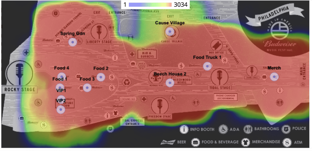
The heat map from Made in America adds to the picture we now have of popular locations during the festival.

For this event, the heat maps for Days 1 and 2 are similar but not identical. A crucial discovery from this data was that the merchandising area (the pale circle on the far right), despite being located by the main entrance, wasn’t popular on either day, something organisers can change at future events.
The Data – Where did people choose to spend their time?
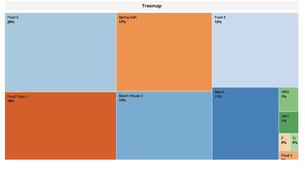
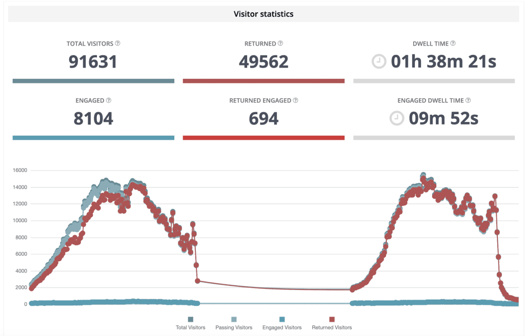
The sensors around the Made in America site give us a detailed picture of traffic (passers-by) and conversion rates (percentage of people who stopped) at food and merchandise stalls. Breakdowns of both the passing footfall and the dwell time of visitors at the merchandising area and each of the four food areas show successful locations and areas for improvement.

A comparison of the footfall and engagement rates of the merchandise area and one of the food stalls shows that in spite of high visitor numbers, not many people stopped for any length of time in the merchandising area.
Food stall two in comparison saw less overall traffic but had a much higher conversion rate to engaged visitors.
As we saw with the heat map, the pattern varies from day one to day two, and hour by hour so organisers can use this data to plan not just locations but staffing rotas as well thanks to the detail and accuracy of the information.
The Results
From a detailed analysis and evaluation of data captured by Exposure Analytics at the Made In America Festival, TOURtech have a clear idea of popular routes around the festival site, what percentage of visitors went to each location, and crucially how long they stayed in key areas.

TOURtech had access to all of this data on the day and can still access it to analyse and better prepare for next year. Alongside previously available measures such as ticket sales, food sales, and merchandise sales they now have detailed visitor data to plan the next Made in America to perfection.
The Future – You know it was a great event, now you can prove it.
You analyse everything you do from your website and your social media to your marketing activity, and sales figures to get the most out your events. Better data means bigger budgets. With our help you can now analyse every aspect of your event to prove what worked or didn’t. We’d love to be part of your future plans, helping to you understand what attracts visitors, how they move around a site, where they spend their time, and how best to engage them.
